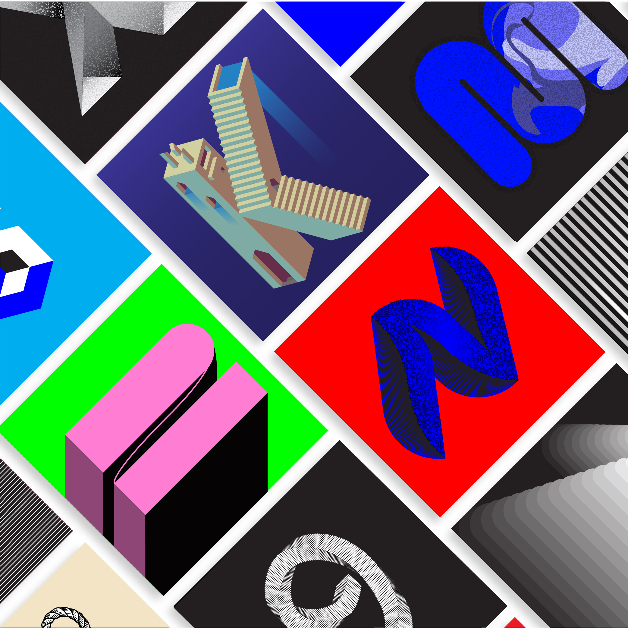
36 Days of Type is a project that invites designers, illustrators and graphic artists to express their particular interpretation of the letters and numbers of the Latin alphabet.

A yearly open call exploring the creative boundaries of letterforms, where participants are challenged to design a letter or number each day for 36 consecutive days, as a global and simultaneous act showing the outcome of the ability to represent the same symbols from thousands different perspectives.
A project that aims to be a space for creation around typography and its endless graphic possibilities.
In this series I have experimented with Adobe Illustrator and approched lettering desig from an illustrative point of view.
The alfaphet has been stretched, distorted, trasformed and made beutiful beyond usability and readability.
The result has been a complete alphabet with experimentation at its core. Letter after letter the boundries of “good type” have been pushed and pushed ad this can be easily seen by comparing the first letter with the last number.
Both make use of the blen tool, but while the “A” is a more conformative repetioon of a single circle, the “9” uses the same principle but it twists and gains a three-dimentionality that the first letter lacks.